Cogntix Flutter Forms
A comprehensive Flutter package providing customizable, reusable form widgets with built-in validation. Simplify form creation and maintain consistency across your Flutter applications.
Features
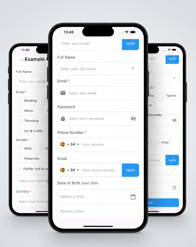
✨ 10 Ready-to-Use Form Widgets
- Text Fields (Standard & with Button)
- Phone Number Fields (Standard & with Button)
- Dropdown Selection
- Checkbox Groups
- Radio Button Groups
- Date & Time Pickers
- Custom Buttons
🎨 Highly Customizable
- Consistent styling across all widgets
- Optional/Required field markers
- Custom colors, icons, and layouts
- Error message support
✅ Built-in Validators
- Email, Password, Phone, Name validation
- Date/Time validation
- Dropdown & Group selection validation
- Custom validation support
Installation
Add this to your package's pubspec.yaml file:
dependencies:
  cogntix_flutter_forms: ^0.0.3
  phone_form_field: ^9.0.0  # Required for phone fields
  intl: ^0.20.2             # Required for date formatting
Then run:
flutter pub get
Quick Start
import 'package:flutter/material.dart';
import 'package:cogntix_flutter_forms/cogntix_flutter_forms.dart';

class MyForm extends StatefulWidget {
  @override
  State<MyForm> createState() => _MyFormState();
}

class _MyFormState extends State<MyForm> {
  final _nameController = TextEditingController();
  String? _nameError;

  @override
  Widget build(BuildContext context) {
    return CustomTextField(
      label: 'Full Name',
      hint: 'Enter your full name',
      controller: _nameController,
      errorMsg: _nameError,
      onChanged: (value) {
        setState(() {
          _nameError = FormValidators.validateName(value);
        });
      },
    );
  }
}
Available Widgets
1. CustomTextField
Standard text input with validation support.
CustomTextField(
  label: 'Email',
  hint: 'Enter your email',
  controller: _emailController,
  prefixIcon: const Icon(Icons.email),
  errorMsg: _emailError,
  keyboardType: TextInputType.emailAddress,
  isOptionalMark: true,
  onChanged: (value) => _emailError = FormValidators.validateEmail(value),
)
2. CustomTextFieldWithButton
Text field with an integrated action button.
CustomTextFieldWithButton(
  label: 'Email',
  hint: 'Enter your email',
  controller: _emailController,
  buttonText: 'Verify',
  onButtonPressed: () => print('Verify clicked'),
  errorMsg: _emailError,
)
3. CustomPhoneTextField
Phone number input with country code selector.
CustomPhoneTextField(
  label: 'Phone Number',
  controller: _phoneController,
  errorMsg: _phoneError,
  onChanged: (phone) => _phoneError = FormValidators.validatePhone(phone),
)
4. CustomPhoneTextFieldWithButton
Phone field with integrated button for OTP verification.
5. CustomDropdownField
Dropdown selection with search functionality.
CustomDropdownField(
  label: 'Country',
  hint: 'Select your country',
  items: {'US': 'United States', 'UK': 'United Kingdom'},
  selectedKey: _selectedCountryKey,
  onChanged: (key, value) => setState(() => _selectedCountryKey = key),
)
6. CustomCheckboxGroup
Multiple selection checkbox group.
CustomCheckboxGroup(
  label: 'Select Your Hobbies',
  items: {'reading': 'Reading', 'gaming': 'Gaming'},
  selectedKeys: _selectedHobbies,
  onChanged: (keys, items) => setState(() => _selectedHobbies = keys),
  layout: CheckboxGroupLayout.vertical,
)
7. CustomRadioGroup
Single selection radio button group.
CustomRadioGroup(
  label: 'Gender',
  items: {'M': 'Male', 'F': 'Female', 'O': 'Other'},
  selectedKey: _selectedGender,
  onChanged: (key, value) => setState(() => _selectedGender = key),
)
8. CustomDateField
Date picker with customizable range and format.
CustomDateField(
  label: 'Date of Birth',
  selectedDate: _selectedDate,
  onChanged: (date) => setState(() => _selectedDate = date),
  firstDate: DateTime(1900),
  lastDate: DateTime.now(),
)
9. CustomTimeField
Time picker with 12/24 hour format support.
CustomTimeField(
  label: 'Preferred Time',
  selectedTime: _selectedTime,
  onChanged: (time) => setState(() => _selectedTime = time),
  use24HourFormat: false,
)
10. CustomButton
Customizable button with loading state.
CustomButton(
  text: 'Submit',
  onPressed: _submitForm,
  isLoading: _isSubmitting,
  backgroundColor: Colors.blue,
  height: 50,
)
Form Validators
Built-in validators for all common form fields:
FormValidators.validateName(value);
FormValidators.validateEmail(value);
FormValidators.validatePassword(value, minLength: 8);
FormValidators.validatePhone(phoneNumber);
FormValidators.validateDropdown(value, fieldName: 'country');
FormValidators.validateCheckboxGroup(keys, fieldName: 'hobby', minSelection: 2);
FormValidators.validateRadioGroup(value, fieldName: 'gender');
FormValidators.validateDate(date);
FormValidators.validateTime(time);
Complete Example
For a complete working example with all widgets, see the example directory.
To run the example:
cd example
flutter pub get
flutter run
The example demonstrates:
- All 10 form widgets in action
- Real-time validation
- Form submission handling
- Best practices for state management
- Customization options
Common Parameters
Most widgets share these common parameters:
| Parameter | Type | Description |
|---|---|---|
label |
String |
Label text above the field |
hint |
String? |
Placeholder text |
errorMsg |
String? |
Error message to display |
isOptionalMark |
bool |
Show "(Optional)" marker |
prefixIcon |
Widget? |
Icon at the start |
enabled |
bool |
Enable/disable the field |
For detailed parameter lists and advanced usage, check the example code.
Styling and Theming
Apply app-wide styling using Flutter's theme:
MaterialApp(
  theme: ThemeData(
    primarySwatch: Colors.blue,
    inputDecorationTheme: InputDecorationTheme(
      border: OutlineInputBorder(
        borderRadius: BorderRadius.circular(10),
      ),
    ),
  ),
  home: MyFormPage(),
);
Requirements
- Flutter SDK:
>=1.17.0 - Dart SDK:
^3.9.0
License
MIT License - Free and open source. See LICENSE for details.
Support
For issues or questions, contact the Cogntix team.
Made with ❤️ by Cogntix