MultiCircularProgressIndicator for Flutter
MultiCircularProgressIndicator is a package that show multiple progress in circular progress bar.User can add as many number of progress he want that will be shown in circular manner and has option for showing shadow of progress bar and there is two progress styles simple and decremented.Also options for two text in center of progress bar.
It works on Android, iOS, macOS, linux, windows and web.
Usage
Simple animation
This example shows how to display a MultiCircularProgressBar.
import 'package:flutter/material.dart';
import 'package:multicircularprogressindicator/models/progress_model.dart';
import 'package:multicircularprogressindicator/multicircularprogressindicator.dart';
import 'package:multiindicator/utils/navigator_util.dart';
import 'package:percent_indicator/percent_indicator.dart';
void main() {
runApp(const MyApp());
}
class MyApp extends StatelessWidget {
const MyApp({super.key});
@override
Widget build(BuildContext context) {
return MaterialApp(
navigatorKey: NavigatorUtil.navigatorKey,
title: 'Flutter Demo',
theme: ThemeData(
colorScheme: ColorScheme.fromSeed(seedColor: Colors.deepPurple),
useMaterial3: true,
),
debugShowCheckedModeBanner: false,
home: const MyHomePage(title: 'Flutter Demo Home Page'),
);
}
}
class MyHomePage extends StatefulWidget {
const MyHomePage({super.key, required this.title});
final String title;
@override
State<MyHomePage> createState() => _MyHomePageState();
}
class _MyHomePageState extends State<MyHomePage> {
int _counter = 0;
void _incrementCounter() {
setState(() {
_counter++;
});
}
@override
Widget build(BuildContext context) {
return Scaffold(
appBar: AppBar(
backgroundColor: Theme.of(context).colorScheme.inversePrimary,
title: Text(widget.title),
),
body: Center(
child: Column(
mainAxisAlignment: MainAxisAlignment.center,
children: <Widget>[
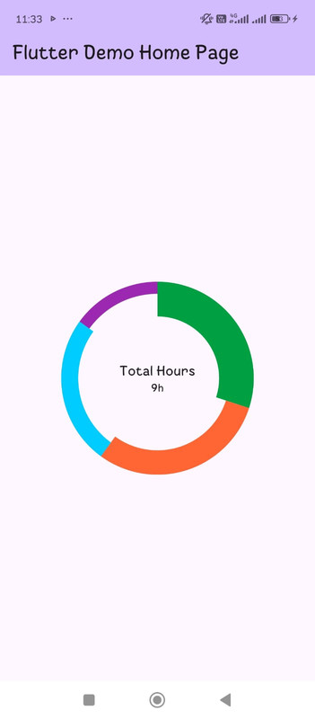
MultiCircularProgressWidget(
listProgress: [
ProgressModel(
progressValue: 0.3,
color: Color.fromARGB(255, 0, 159, 66),
),
ProgressModel(
progressValue: 0.3,
color: Color.fromRGBO(255, 102, 52, 1.0),
),
ProgressModel(
progressValue: 0.25,
color: Color.fromRGBO(0, 204, 255, 1.0),
),
ProgressModel(progressValue: 0.15, color: Colors.purple),
],
radius: 120,
topText: "Total Hours",
bottomText: "9h",
circularStrokeCap: CircularStrokeCap.butt,
progressStyle: ProgressStyle.decremented,
isShadowed: true,
)
],
),
),
);
}
}
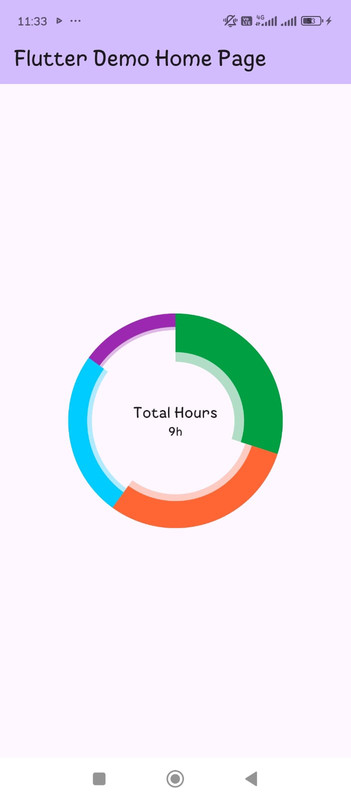
More Control
You can change to achieve other effects like isShadowed to false to off the shadow and also circularStrokeCap to round for other effects.