bottom_picker 1.7.0  bottom_picker: ^1.7.0 copied to clipboard
 badrkouki.dev
A new flutter package that let you create a bottom item picker or date & time picker with minmum parameters
Bottom Picker #
Easy way to display bottom picker item or date/time picker
 |
 |
|---|---|
 |
 |
Features #
- Simple list picker wheel
- Date picker
- Time picker
- Date and Time picker
- 24h / 12h time format
- Built-in themes
- Customize confirm button
- Customize first selected item
- Enhanced tablet view
- Customize background color
- Customize date format order
- Customize picker text style (color, font size, font weight...)
- Customize close button style and display
- Customize layout orientation (LTR / RTL )
- Customize button alignment
- Customizable bottom picker height
Getting Started #
To add bottom picker to your project add this line to your pubspec.yaml file
dependencies:
	bottom_picker: ^1.7.0
Parameters #
///The title of the bottom picke
///it's required for all bottom picker types
final String title;


///The text style applied on the title
///by default it applies simple text style
final TextStyle titleStyle;


///defines whether the bottom picker is dismissable or not
///by default it's set to false
final bool dismissable;


///list of items (List of text) used to create simple item picker (required)
///and should not be empty or null
///for date/dateTime/time items parameter is not available
late List<Text>? items;


///Nullable function, invoked when navigating between picker item
///whether it's date picker or simple item picker it will return a value DateTime or int(index)
final Function(dynamic)? onChange;


///Nullable function invoked when clicking on submit button
///if the picker type is date/time/dateTime it will return DateTime value
///else it will return the index of the selected item
final Function(dynamic)? onSubmit;


///Invoked when clicking on the close button
final Function? onClose;


///set the theme of the bottom picker (the button theme)
///possible values
///{
///blue,
///orange,
///temptingAzure,
///heavyRain,
///plumPlate,
///morningSalad
///}
final BOTTOM_PICKER_THEME bottomPickerTheme;


///to set a custom button theme color use this list
///when it's not null it will be applied
final List<Color>? gradientColors;


///define the icon color on the button
///by default it's White
final Color iconColor;


///used for simple bottom picker
///by default it's 0, needs to be in the range [0, items.length-1]
///otherwise an exception will be thrown
///for date and time picker type this parameter is not available
late int selectedItemIndex;


///The initial date time applied on the date and time picker
///by default it's null
DateTime? initialDateTime;


///the max date time on the date picker
///by default it's null
DateTime? maxDateTime;


///the minimum date & time applied on the date picker
///by default it's null
DateTime? minDateTime;


///define whether the time uses 24h or 12h format
///by default it's false (12h format)
late bool use24hFormat;


///the text that will be applied to the button
///if the text is null the button will be rendered with an icon
final String? buttonText;


///the button text style, will be applied on the button's text
final TextStyle? buttonTextStyle;


///display button icon
///by default it's true
///if you want to display a text you can set [displayButtonIcon] to false
final bool displayButtonIcon;


///a single color will be applied to the button instead of the gradient
///themes
final Color? buttonSingleColor;


///the bottom picker background color,
///by default it's white
final Color backgroundColor;


///date order applied on date picker or date time picker
///by default it's YYYY/MM/DD
late DatePickerDateOrder? dateOrder;


///the picker text style applied on all types of bottom picker
///by default `TextStyle(fontSize: 14)`
final TextStyle pickerTextStyle;


///define the picker item extent available only for list items picker
///by default it's 35
late double itemExtent;


///indicate whether the close icon will be rendred or not
/// by default `displayCloseIcon = true`
final  bool  displayCloseIcon;


///the close icon color
///by default `closeIconColor = Colors.black`
final  Color  closeIconColor;


///the layout orientation of the bottom picker
///by default the orientation is set to LTR
///```
///LAYOUT_ORIENTATION.ltr,
///LAYOUT_ORIENTATION.rtl
///```
final  LAYOUT_ORIENTATION  layoutOrientation;

///THe alignement of the bottom picker button
///by default it's `MainAxisAlignment.center`
final MainAxisAlignment buttonAlignement;

///bottom picker main widget height
///if it's null the bottom picker will get the height from
///[bottomPickerHeight] extension on context
final double? height;
Examples #
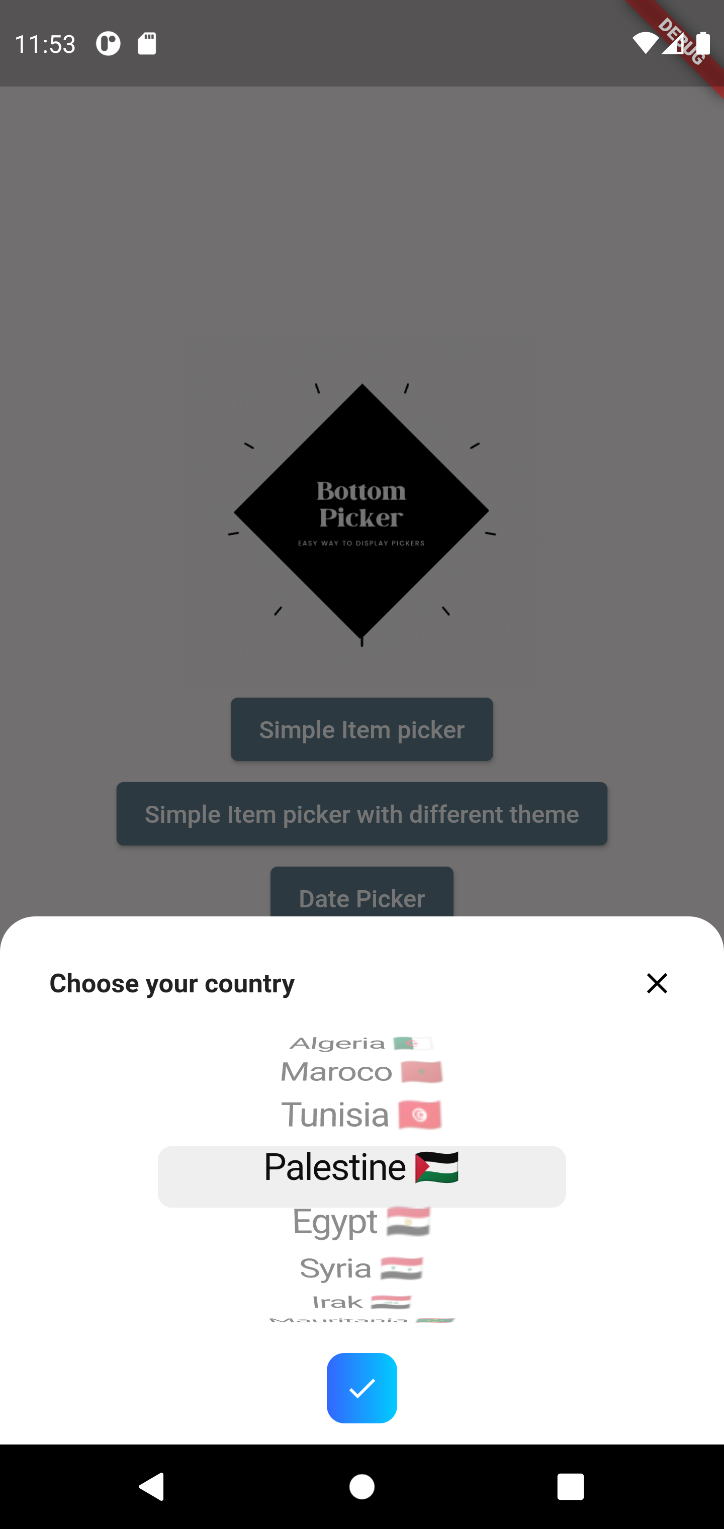
Simple item picker
BottomPicker(
	items: items,
	title:  "Choose your country",
	titleStyle: TextStyle(fontWeight: FontWeight.bold, fontSize:  15)
).show(context);
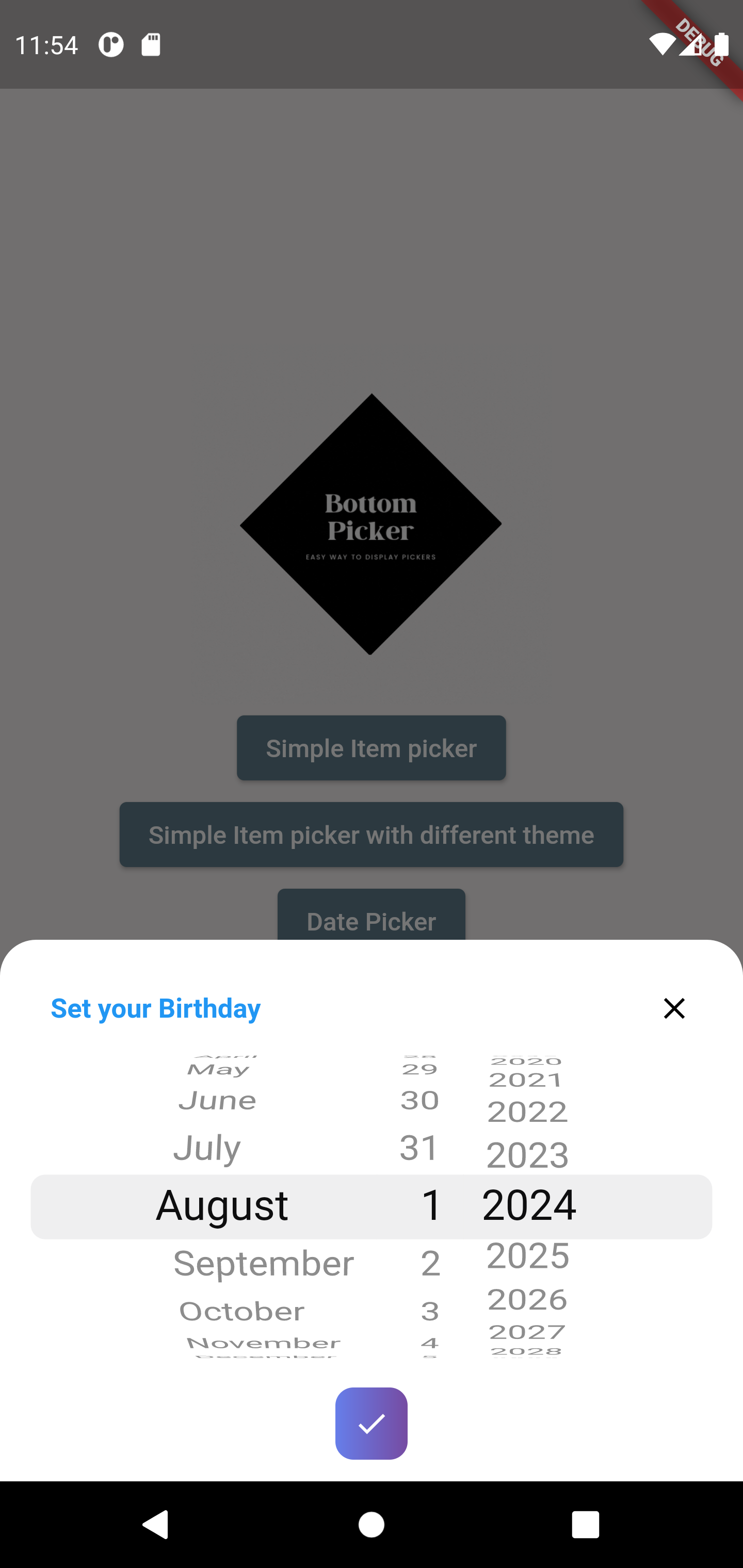
Date picker
BottomPicker.date(
	title:  "Set your Birthday",
	titleStyle: TextStyle(
		fontWeight: FontWeight.bold,
		fontSize:  15,
		color: Colors.blue
	),
	onChange: (index) {
		print(index);
	},
	onSubmit: (index) {
		print(index);
	},
	bottomPickerTheme: BOTTOM_PICKER_THEME.plumPlate
).show(context);
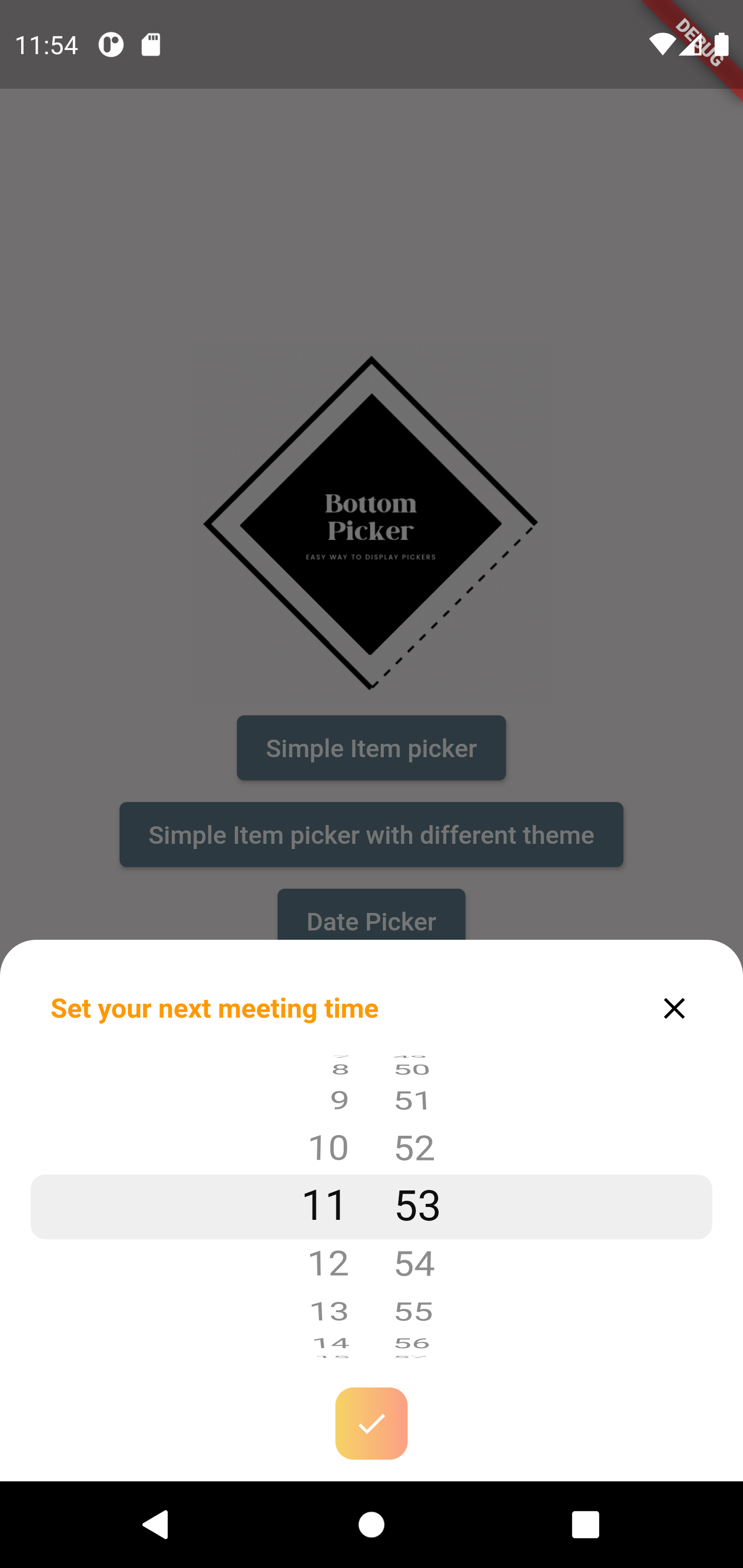
Time picker
BottomPicker.time(
	title:  "Set your next meeting time",
	titleStyle: TextStyle(
		fontWeight: FontWeight.bold,
		fontSize:  15,
		color: Colors.orange
	),
	onSubmit: (index) {
		print(index);
	},
	onClose: () {
		print("Picker closed");
	},
	bottomPickerTheme: BOTTOM_PICKER_THEME.orange,
	use24hFormat:  true
).show(context);
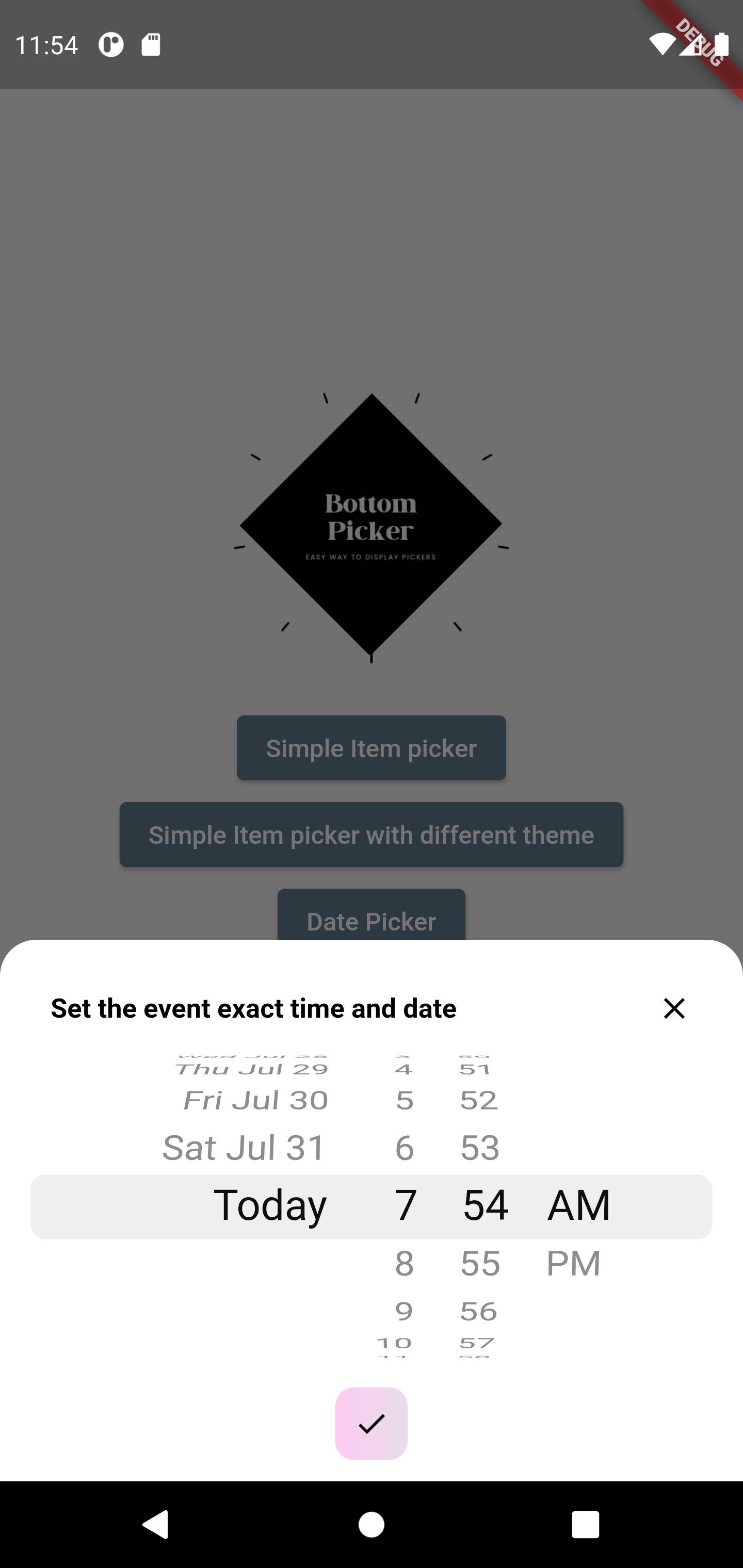
Date & Time picker
BottomPicker.dateTime(
	title:  "Set the event exact time and date",
	titleStyle: TextStyle(
		fontWeight: FontWeight.bold,
		fontSize:  15,
		color: Colors.black
	),
	onSubmit: (index) {
		print(index);
	},
	onClose: () {
		print("Picker closed");
	},
	iconColor: Colors.black,
	minDateTime: DateTime(2021,7,1),
	maxDateTime: DateTime(2021,8,2),
	gradientColors: [Color(0xfffdcbf1),Color(0xffe6dee9)]
).show(context);
With custom button design
BottomPicker.dateTime(
	title:  "Set the event exact time and date",
	titleStyle: TextStyle(
		fontWeight: FontWeight.bold,
		fontSize:  15,
		color: Colors.black
	),
	onSubmit: (date) {
		print(date);
	},
	onClose: () {
		print("Picker closed");
	},
	buttonText:  'Confirm',
	buttonTextStyle:  const TextStyle(
		color: Colors.white
	),
	buttonSingleColor: Colors.pink,
	minDateTime: DateTime(2021, 5, 1),
	maxDateTime: DateTime(2021, 8, 2),
).show(context);
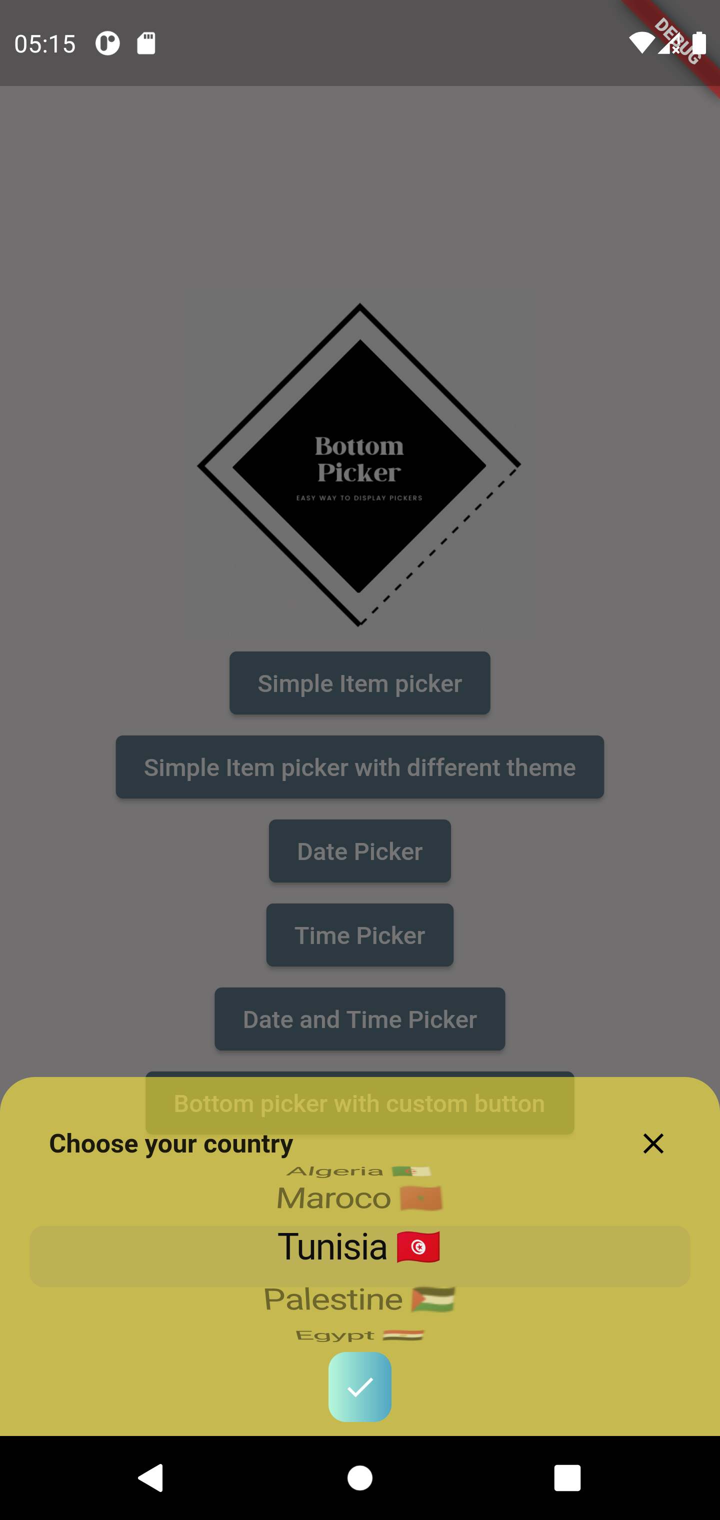
With custom background
BottomPicker(
	items: items,
	title:  'Choose your country',
	titleStyle: TextStyle(fontWeight: FontWeight.bold, fontSize:  15),
	backgroundColor: Colors.yellow.withOpacity(0.6),
	bottomPickerTheme: BOTTOM_PICKER_THEME.morningSalad,
	onSubmit: (index) {
		print(index);
	},
).show(context);
With custom picker text style
BottomPicker(
	items: [
		Text('Leonardo DiCaprio'),
		Text('Johnny Depp'),
		Text('Robert De Niro'),
		Text('Tom Hardy'),
		Text('Ben Affleck'),
	],
	title:  'Select the actor',
	pickerTextStyle: TextStyle(
		color: Colors.blue,
		fontSize:  12,
		fontWeight: FontWeight.bold,
	),
).show(context);

With custom close button style
BottomPicker(
	items: [
		Text('Leonardo DiCaprio'),
		Text('Johnny Depp'),
		Text('Robert De Niro'),
		Text('Tom Hardy'),
		Text('Ben Affleck'),
	],
	title:  'Select the actor',
	pickerTextStyle: TextStyle(
		color: Colors.blue,
		fontSize:  12,
		fontWeight: FontWeight.bold,
	),
	closeIconColor: Colors.red
).show(context);

Contribution #
You can contribute to it https://github.com/koukibadr/Bottom-Picker
- If you found a bug, open an issue.
- If you have a feature request, open an issue.
- If you want to contribute, submit a pull request.
Contributors #
Metadata
354
likes
0
points
14.6k
downloads
Publisher
Weekly Downloads
Metadata
A new flutter package that let you create a bottom item picker or date & time picker with minmum parameters
Repository (GitHub)
View/report issues
License
 unknown (license)