chaos_wave_button 0.0.2  chaos_wave_button: ^0.0.2 copied to clipboard
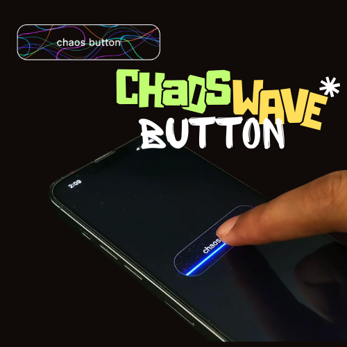
A Flutter package providing customizable buttons with wave and electric animations, including optional haptic feedback using the vibration package.
Chaos Wave Button #
Chaos Wave Button is a dynamic Flutter package that brings captivating wave and electric current-like animations to your buttons. When tapped, the buttons display mesmerizing animated lines that flow or pulse, enhanced with neon metallic effects and vibrations.
Features #
- Wave and Electric Animations: Features flowing wave patterns (WaveButton) and jagged electric current effects (ChaosButton) that animate on tap.
- Neon Metallic Design: Utilizes vibrant gradients and glow effects for a premium, futuristic look.
- Haptic Feedback: Includes optional vibration on tap using the vibration package for enhanced user interaction.
- Highly Customizable: Adjust width, height, border radius, background color, line colors, animation duration, text, and intensity.
- Interactive: Supports tap callbacks for seamless integration with your app’s logic.
- Lightweight: Built with CustomPainter for smooth, CPU-efficient animations without external dependencies.
- Easy Integration: Simple widget-based API for quick setup in any Flutter project.
Installation #
To use the chaos_wave_button package in your Flutter project, follow these steps:
Add the following to your pubspec.yaml:
dependencies:
  chaos_wave_button: ^0.0.1
Run flutter pub get to install the package.
Android #
Add the VIBRATE permission to your android/app/src/main/AndroidManifest.xml:
<uses-permission android:name="android.permission.VIBRATE"/>
Ensure your app's android/app/build.gradle sets the minSdkVersion to 21:
android {
    defaultConfig {
        minSdkVersion 21
    }
}
Usage (💻 Example) #
Below is a complete example of how to use WaveButton and ChaosButton in your Flutter app:
import 'package:flutter/material.dart';
import 'package:chaos_wave_button/chaos_wave_button.dart';

void main() {
  runApp(const MyApp());
}

class MyApp extends StatelessWidget {
  const MyApp({super.key});

  @override
  Widget build(BuildContext context) {
    return MaterialApp(
      home: Scaffold(
        backgroundColor: Colors.grey[900],
        appBar: AppBar(
          backgroundColor: Colors.grey[900],
          title: const Text(
            'Chaos Wave Button Preview',
            style: TextStyle(color: Colors.white),
          ),
        ),
        body: Center(
          child: Column(
            mainAxisAlignment: MainAxisAlignment.center,
            children: [
              WaveButton(
                width: 250.0,
                height: 70.0,
                text: 'Wave Button',
                textStyle: const TextStyle(
                  color: Colors.white,
                  fontSize: 16.0,
                  fontWeight: FontWeight.bold,
                ),
                borderRadius: BorderRadius.circular(20.0),
                border: Border.all(color: Colors.black),
                backgroundColor: Colors.black,
                lineColors: const [
                  Colors.purpleAccent,
                  Colors.blue,
                  Colors.orange,
                  Colors.green,
                ],
                animationDuration: const Duration(milliseconds: 500),
                onTap: () {
                  print('Wave Button Pressed!');
                },
              ),
              const SizedBox(height: 30),
              ChaosButton(
                width: 250.0,
                height: 70.0,
                text: 'Chaos Button',
                textStyle: const TextStyle(
                  color: Colors.white,
                  fontSize: 16.0,
                  fontWeight: FontWeight.bold,
                ),
                borderRadius: BorderRadius.circular(20.0),
                border: Border.all(color: Colors.black),
                backgroundColor: Colors.black,
                lineColors: const [
                  Colors.purpleAccent,
                  Colors.blueAccent,
                  Colors.cyanAccent,
                  Colors.lightGreenAccent,
                ],
                animationDuration: const Duration(milliseconds: 800),
                intensity: 1.2,
                onTap: () {
                  print('Chaos Button Pressed!');
                },
              ),
            ],
          ),
        ),
      ),
    );
  }
}
Customization Options #
Common Properties
- width: The width of the button (default: 200.0).
- height: The height of the button (default: 60.0).
- borderRadius: The border radius of the button (default: Radius.circular(12.0)).
- backgroundColor: The background color of the button (default: Colors.black).
- lineColors: A list of colors for the animated lines (default: [Colors.purpleAccent, Colors.blue, Colors.orange, Colors.green] for WaveButton, [Colors.purpleAccent, Colors.blueAccent, Colors.cyanAccent, Colors.lightGreenAccent] for ChaosButton).
- animationDuration: The duration of the tap animation (default: 500ms for WaveButton, 800ms for ChaosButton).
- onTap: A callback function triggered on tap.
- text: The text to display on the button (default: '').
- textStyle: The style of the button text (default: white, bold, 16.0 font size).
- border: The border style of the button (default: null).
WaveButton Specific
No additional properties beyond the common ones.
ChaosButton Specific
- intensity: Controls the number and complexity of electric lines (default: 1.0, range: 0.5–2.0 for varied effects).
Changelog #
See the CHANGELOG.md file for updates.
License #
This package is licensed under the MIT License.
Author #
Metadata
Publisher
unverified uploader
Weekly Downloads
Metadata
A Flutter package providing customizable buttons with wave and electric animations, including optional haptic feedback using the vibration package.
Repository (GitHub)
View/report issues
Documentation
License
 MIT (license)