expandable 2.2.2+3  expandable: ^2.2.2+3 copied to clipboard
A Flutter widget that can be expanded or collapsed by clicking on a header or an icon.
Expandable #
A Flutter widget that can be expanded or collapsed by the user.
Introduction #
This library helps implement expandable behavior as prescribed by Material Design:
Expandable should not be confused with
ExpansionPanel.
ExpansionPanel, which is a part of
Flutter material library, is designed to work only within ExpansionPanelList and cannot be used
for making other widgets, for example, expandable Card widgets.
Usage #
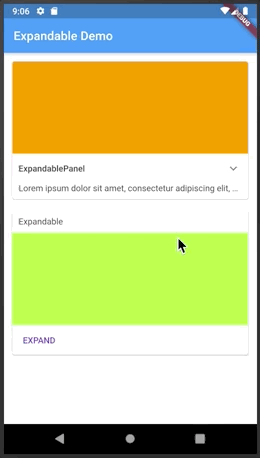
The easiest way to make a user-expandable widget is to use ExpandablePanel:
/// Shows a header along with an indicator icon, and expandable text below it:
class Widget1 extends StatelessWidget {

  @override
  Widget build(BuildContext context) {
    return ExpandablePanel(
      header: Text("Lorem ipsum",
        style: Theme.of(context).textTheme.body2,
      ),
      expanded: Text(loremIpsum, softWrap: true, ),
      tapHeaderToExpand: true,
      hasIcon: true,
    );
  }
}
You can also implement complex expandable widgets by controlling the state of Expandable widgets
using ExpandableController. The controller is provided to Expandable widgets by the means
of ExpandableNotifier. The following example demonstrates this usage pattern:
/// This widget has three sections: title, pictures, and description, which all expand
/// then the user clicks on the EXPAND button at the bottom.
class Widget2 extends StatelessWidget {

  @override
  Widget build(BuildContext context) {
    return ExpandableNotifier(
      controller: ExpandableController(false),
      child: Column(
        crossAxisAlignment: CrossAxisAlignment.start,
        children: <Widget>[
          Expandable(
            collapsed: buildCollapsedTitle(),
            expanded: buildExpandedTitle(),
          ),
          Expandable(
            collapsed: buildCollapsedPictures(),
            expanded: buildExpandedPictures(),
          ),
          Expandable(
            collapsed: buildCollapsedDescription(),
            expanded: buildExpandedDescription(),
          ),
          Divider(height: 0.0,),
          Row(
            mainAxisAlignment: MainAxisAlignment.start,
            children: <Widget>[
              Builder(
                builder: (context) {
                  var exp = ExpandableController.of(context);
                  return MaterialButton(
                    child: Text(exp.expanded ? "COLLAPSE": "EXPAND",
                      style: Theme.of(context).textTheme.button.copyWith(
                        color: Colors.deepPurple
                      ),
                    ),
                    onPressed: () {
                      exp.toggle();
                    },
                  );
                }
              ),
            ],
          ),
        ],
      ),
    );
  }
}
Migration from version 1.x #
When Expandable was initially created, it was using Scoped Model plugin
for communicating state changes. In version 2.0.0 the dependency on ScopedModel was eliminated.
This is a breaking change, so a code change is necessary to make the code work. The migration is mainly a search/replace:
ScopedModel<ExpandableModel>->ExpandableNotifierExpandableModel->ExpandableControllerScopedModel.of<ExpandableModel>->ExpandableController.of
Metadata
Publisher
unverified uploader
Weekly Downloads
Metadata
A Flutter widget that can be expanded or collapsed by clicking on a header or an icon.
Repository (GitHub)
View/report issues
License
 unknown (license)